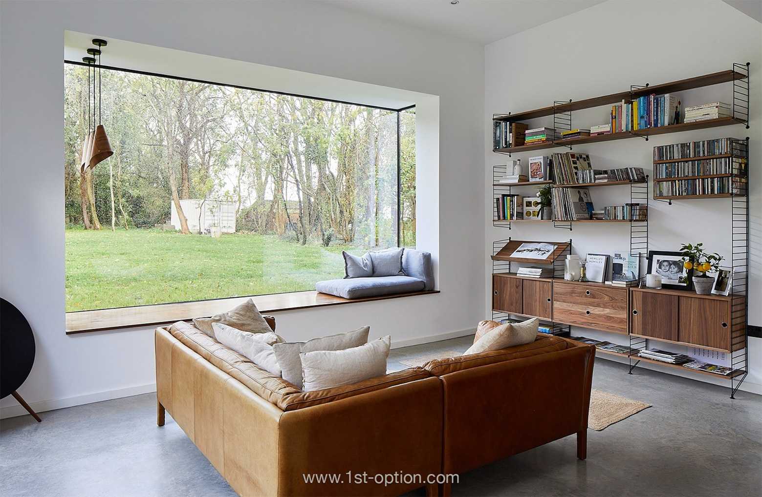
In the Spotlight: Japandi Design
Intro
As the name suggests, Japandi design refers to the blend of Scandinavian and Japanese interior styles. Why would you blend these two unlikely trends? Well, they’re both actually fairly similar and promote similar core tenets, in fact elevating each other. They both focus on simplicity, natural elements and comfort, so it’s a no-brainer that designers decided to merge them together. Though it’s still a fairly new design style, it has risen to popularity very fast and isn’t showing any signs of going anywhere – expect to see it populating your Instagram feeds for years to come. If you want to get to grips with this ever popular and current design trend that is taking the world by storm, make sure you read on as we deep dive into the trend’s characteristics, why Scandi and Japanese blend so well together and how to get it right in your own home.
What is Japandi design
As a mixture of both Scandi and Japanese design styles, Japandi is influenced by two schools of thought that actually promote many similar ways of life and design tropes. Firstly, you have the Japanese philosophy of wabi-sabi – a lifestyle that embraces and values slow living, contentment, simplicity and the beauty in imperfection. You then have the Nordic practice of hygge – a custom that promotes comfort, cosiness, wellbeing and the pursuit of happiness; you get the smooth, modern lines of Scandi and blend it with sleek, functional elegance of Japanese style. You are left with a minimal-yet-welcoming and functional-yet-cosy space that utilises neutral tones, lots of texture and heaps of natural materials. This fusion creates the perfect blend of function and form, focusing on clean lines, bright spaces, and light colours. While both individual styles promote function over form, they both advocate a pleasing and welcoming space with well curated furniture that is right for the space; Japandi spaces aren’t sparse, they’re intentional. The key principles of Japandi design include minimalism at its heart and the incorporation of sustainable, eco-friendly materials (no wonder its popularity has grown so much over the past few years).
How to do it yourself
If you’re a fan of Scandi/ minimalist design, chances are that you’ve probably already incorporated elements of Japandi into your home; let’s break down the key ideas and principles, offering some tips on how to do it in your own home.
Natural materials
Using natural materials is one of the easiest ways to bring the style into your home. Look to materials that encourage simplicity and beauty like bamboo or unrefined woods. Key sustainable materials to implement include cotton, bamboo, rattan, hemp and paper. For visual interest, you can add in some cool metals too (if you’re feeling fancy). Natural doesn’t merely refer to pieces of furniture, showcase plants and natural colours within your home too – think beige, sand, cream, taupe, oatmeal and stone. The idea is to use subtle and supple tones that blend into the space; nothing too bright or harsh that can dominate attention. Remember you are trying to create a calm and harmonious atmosphere. If you feel the area is too bland, soft, tranquil colours can be incorporated to add visual depth. Pale pinks, blues, greens and greys are great, or add some richness with a darker accent colour, such as black or a charcoal grey.
Reduce clutter
When you think of a minimalist space, clean lines and open spaces are probably the first things that come to mind – this is exactly the case with Japandi. Reducing clutter is the easiest way to implement this within your home and get that Japandi feel instantly. If you have an active household, play around with natural containers like boxes and baskets that store your stuff away, whilst still encapsulating the clean aesthetic of the style. Another great way to achieve the feel without throwing things away is to pop in a folding screen that can tidy your stuff away behind it (the ideal accessory when entertaining). Great ways to make the room feel cosier without adding clutter are mirrors, picture frames, artwork, wall hangings, table lamps, vases and rugs. Our favourite way to achieve the look is to implement house plants, they add the natural element, improve air quality, are welcoming and fill your space without cluttering at all. They also have huge health benefits, so if you want to add the eco-friendly tenet, whilst staying true to the individual areas’ heritage, look to plants that are native to their individual regions. A true authentic aesthetic!
Craftsmanship
Craftsmanship is at the style’s core, focusing on well-made, quality products. Ask yourself, is this going to stand the test of time – will its condition hold up, but also will it still be stylish in years to come? With its focus on sustainability, Japandi is the antidote to fast fashion and the one-time-use culture we have become so accustomed to. While both Scandi and Japanese design promote top quality goods on their own, they do differ in the look of the furniture – Scandi design is all about clean lines and angular pieces, while Japanese prefers curved and used objects that have had a life. Mix and match with both to create further visual interest. Don’t forget that there is a need for cohesion, achieve this through either colour, shape or size.
Texture
The best way to add warmth and interest to your Japandi space is to add different textures and fabrics. The Japanese are renowned for their use of eye-catching intricate patterns, so incorporate them into your cushions, throws, curtains and tableware; indulgent textures will help to advocate hygge and patterns will add vibrancy. Texture is key in helping to keep your space feeling warm and welcoming, rather than cold and stark. Rugs are the perfect hygge element as they are cosy, functional, don’t add clutter and perfectly complement wooden floors, stopping them from feeling inhospitable and bare.


